The competition I analyzed was an August 2018 r/dataisbeautiful contest involving a raw dataset of every line in the office. The data had the season, episode, scene, quoted character, and a text string of their line, along with a unique id for each line. It looked like this:
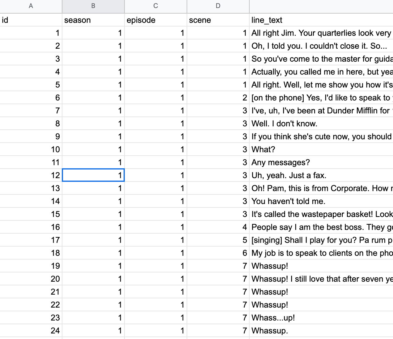
Reading the data into R was not particularly difficult, as I just downloaded the google sheets file as a csv and then read the csv into R. One aspect that was a bit more difficult was creating a new column titled “word count” whose function is self-evident. I accomplished this using the R function
office_lines <- office_lines %>%
mutate(characters=nchar(line_text),
words=lengths(gregexpr("\\W+", line_text)) + 1)
which counted the amount of word separators and added one to get a final word count. This allowed for, in my opinion, a more specific analysis. This way, a 5 minute Michael Scott rant is valued differently than a disdained one word line from Stanley. For all of my charts, I used word count instead of line count due to this exact reason.
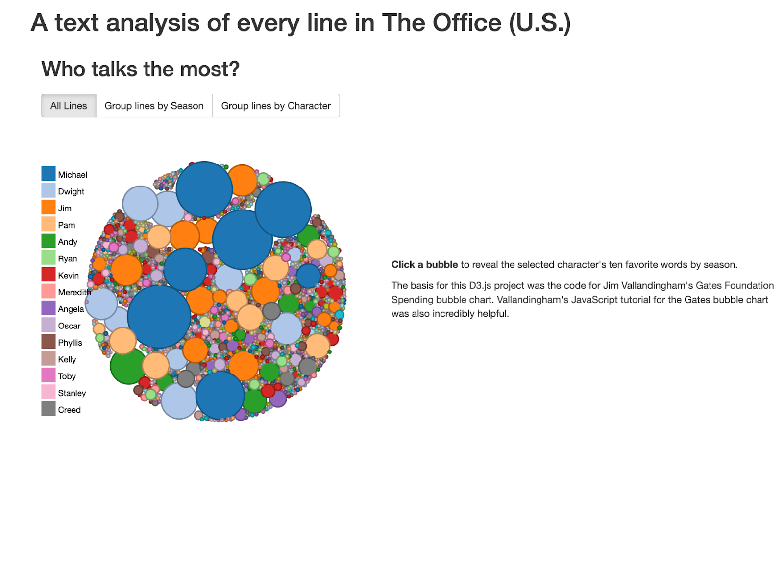
The first graphic I critiqued was the interactive chart showing how often every character talked. The visualization was just messy, and I didn’t think the interactive part added a ton. It was cool how it showed the most common lines by each character, though. The issue is that the only dots that can really be appreciated are the Michael dots, and they are placed randomly across the circle. Visually, it just doesn’t do much.
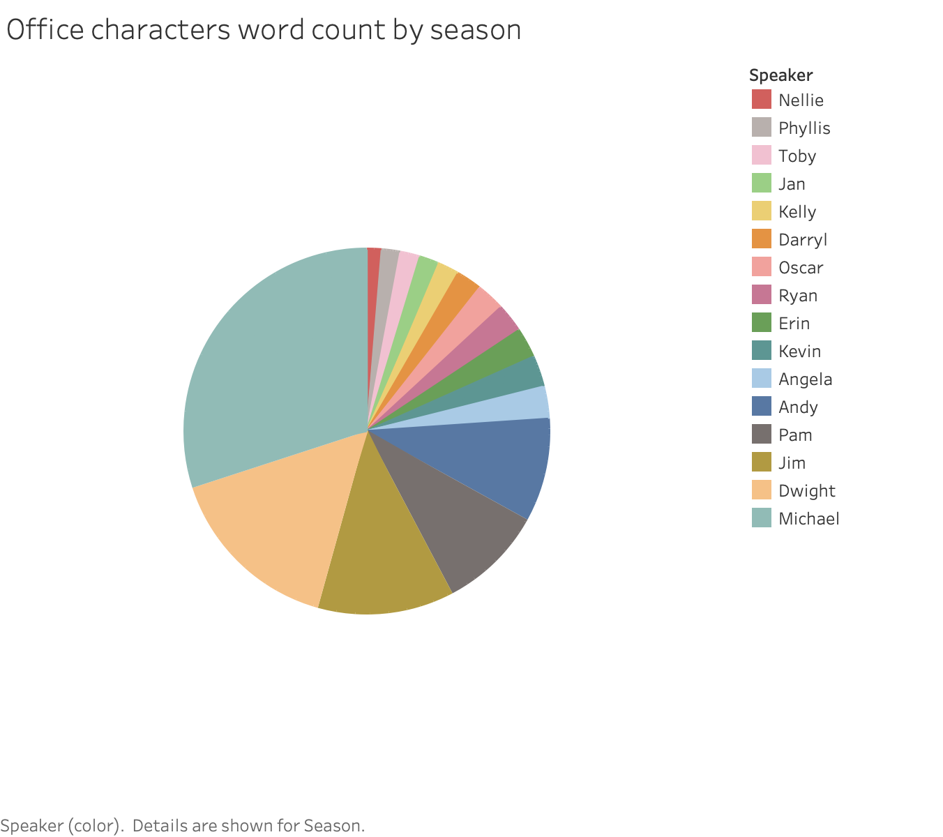
I believe my version is superior because it demonstrates the portion of words that were spoken by each character more effectively. I’m not a huge fan of pie charts, but I think the order is much clearer and presents data a lot better. One issue was that, since I made it interactive by season when you hover your cursor over it, I couldn’t actually label each slice by the individual character. If I figured that out in time, I would have, because it isn’t very visually appealing to have to check the legend if you want to know which character is which.
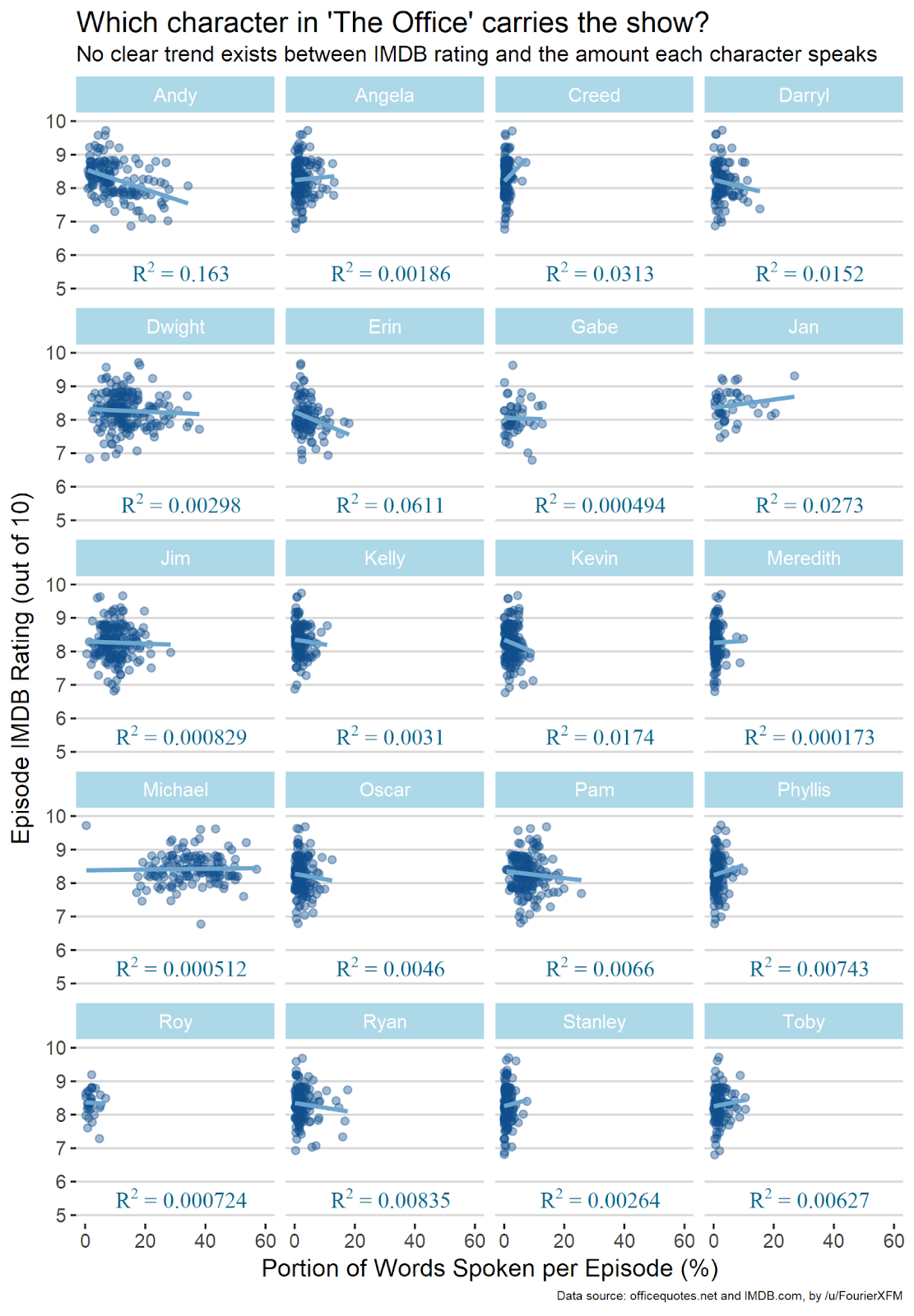
This chart was easily my favorite concept, but it had a few flaws. I love the fact that it attempts to quantify the impact of each character. Even if there are obvious issues with this approach, it is probably the best that can be done with this data. That said, I didn’t like a few things. For one, it only includes episodes that the character appeared in. This makes no sense! If you had x episodes, and a character was gone for half of them and those episodes were a lot worse, wouldn’t it be something of a reasonable conclusion to say that that character was very valuable to the show? Zero words spoken is still an amount of words that should be factored. The other issue was displaying the R2 value instead of the R value, because R2 is always positive and therefore doesn’t show whether or not the trend was negative. This is important in this context because we want to know if the character has a positive or negative effect.
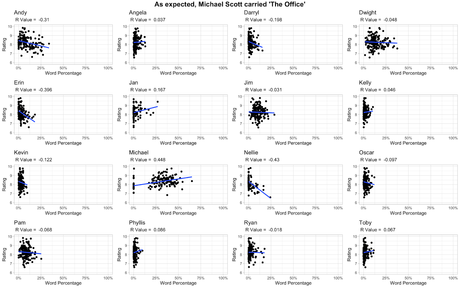
I basically did the same thing as this guy but with the necessary changes outlined. As you can see, the R value for Michael Scott goes way up, because the show got dramatically worse after he left. I also believe that my chart is a little cleaner and nicer to look at.
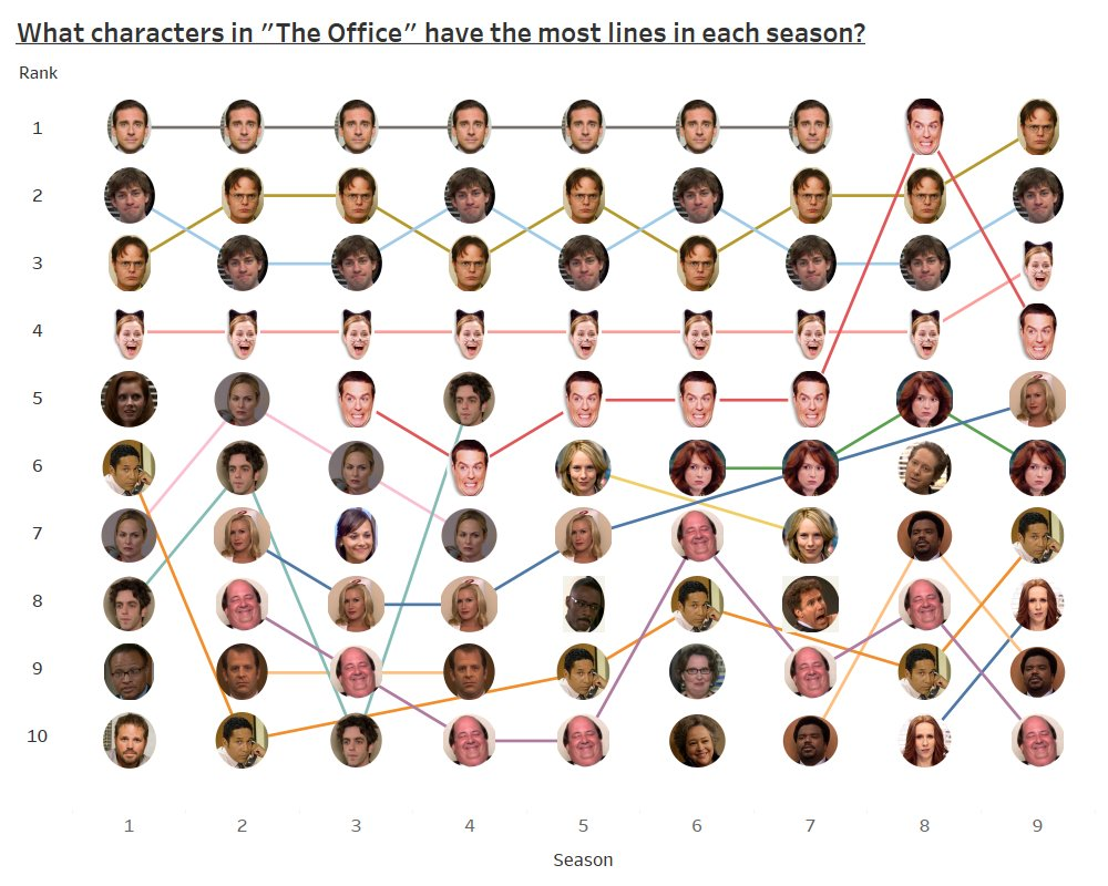
This was easily the best chart, because it perfectly answers the question that needed to be answered and left nothing out. I have the one small issue with characters who fell out of the top 10 still getting a continuous line connected to their next top 10 appearance, and Andy’s picture is really stupid. I also don’t like how Andy led the entire show in lines in season 8, that is just tragic. There was not much I could do to improve upon this chart, so I instead made one with a completely different concept.
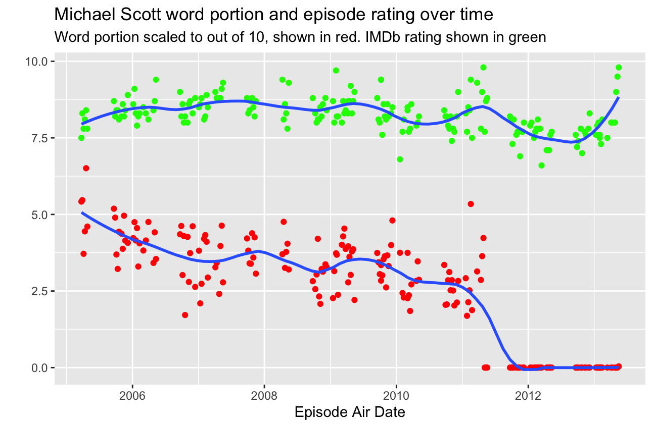
This is a time series chart showing both the IMDB episode rating and the portion of words spoken by Michael Scott in that episode. I like this concept because it shows two different valuable time series at the same time. Although the two y variables are different and this creates confusion, they are somewhat related and create an interesting look into their relation. However, since they are still truly scaled differently, things can be improved.
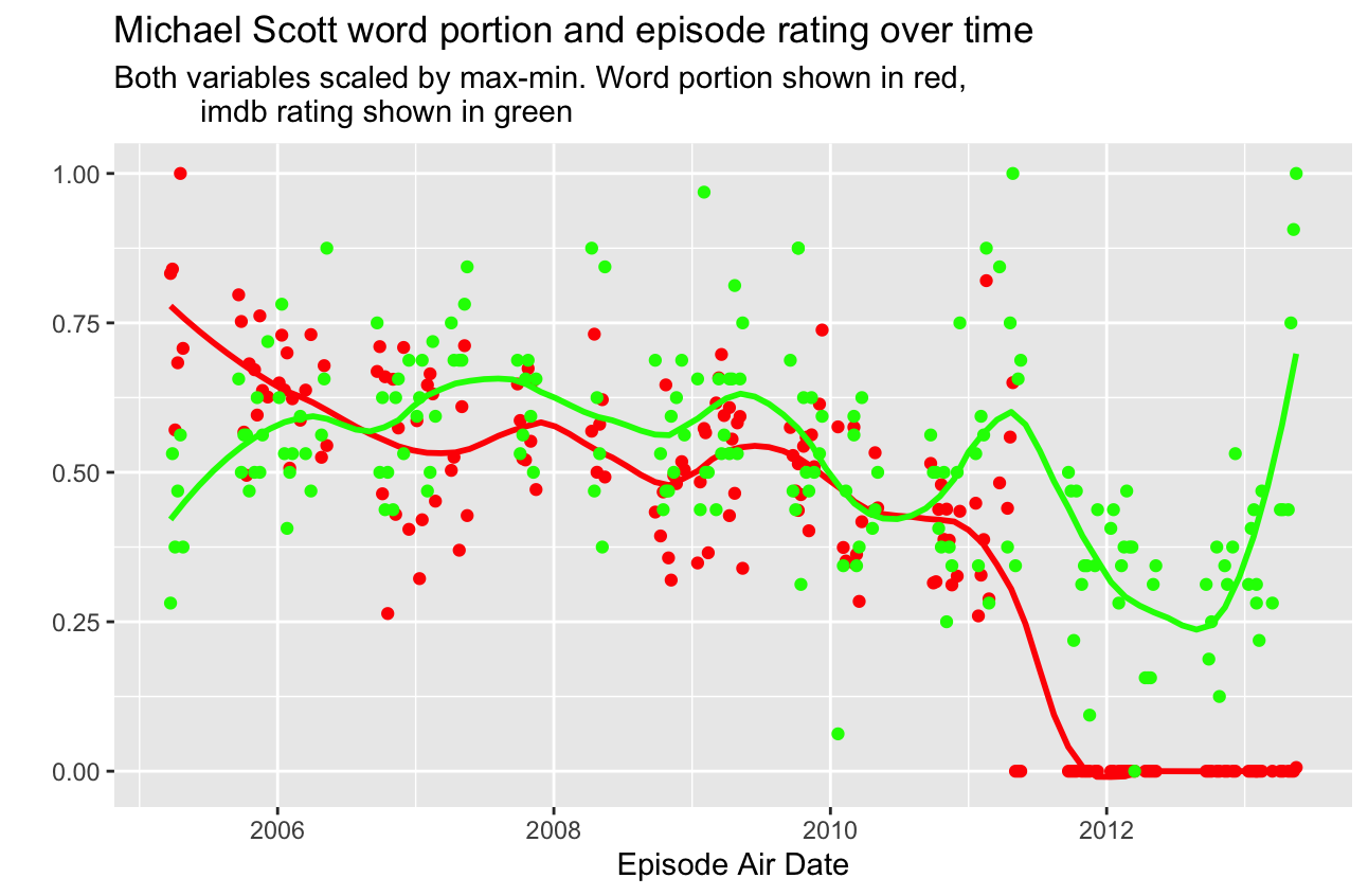
I think it was Eli who suggested scaling the data so we could see a stronger relationship. I had thought of this, but I didn’t have the mental energy to execute this idea after already being done with my work. However, it was much easier than I thought, and I think it shows a pretty strong relationship between the two variables. The obvious downside here is that we take away a quantitative meaning from each variable, but the upside is that we still get to experience the visual time series effect while also seeing a pretty strong relationship between the two variables. The exception is obviously towards the end of the show, when Michael was gone, because generally speaking, series finales tend to get very high ratings if the show has a passionate following. Outside of this blip, there is a very clear relationship between how often Michael spoke and how highly the episode was regarded.